ALIBABA
Improve User Experience of AliExpress Mobile and Website
DURATION
Nov. 2015 - Sept. 2016
MY ROLE
UX Research Intern
COMPANY
Department of International User Experience (UED)

OVERVIEW
WHAT ARE MY CONTRIBUTIONS?
During my internship, I ...
Planned & Conducted 4-Phase User Tests
I worked with designers, engineers and product managers to test 6-10 design solutions for mobile or website in each phase.
Tested with 120+ Users from 14+ Countries
I employed different testing methods and tools for validating design solutions, including interviews, usability tests, eye-tracking experiments, A/B testing, card sortings, and surveys
Improved 17 Modules on AliExpress Mobile/Web
I made constructive suggestions to the design team to improve the interaction and visual design of 17 modules (e.g. the flow of purchase confirmation), which were later validated by online A/B tests.
WHAT IS AliExpress
AliExpress is a global e-commerce platform made up of small business sellers and offers a wide variety of consumer products worldwide. Spanning over 200 countries and regions, AliExpress boasted 100 million users by 2017

CASE STUDY: AN EXAMPLE OF MY WORK
Making Navigating with Category more efficient and attractive
Based on user study results, we suggested a new design for the Category module on AliExpress mobile, which navigates customers to make purchases when they only have general purchasing goals.
This design iteration was also validated in online A/B testing. Gross Merchandise Volume was increased in the new version compared with the old version,
The new design was launched in AliExpress Shopping App 5.1.0
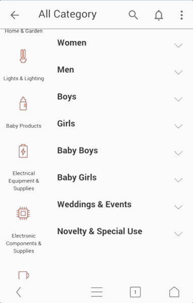
The Old Version

The New Version
* They were web-based prototypes buildt for testing
TRANSFERRING DESIGN INTO TEST VARIABLES
In the team of 4 UX researcher, I led the user research process of planning research protocol, recruiting participants, conducting experiments and interviews, as well as analyzing quantitative and qualitative data. After discussing with designers and product managers, I disassembled 7 different design solutions for the Category module into two variables: Category Types and Information Forms
For testing solutions, we collaborative with front-end engineers to build functional mockups with HTML5 and JavaScript, and all tabs are clickable
Interaction Types:
Focused attention vs. Efficient Switching
We have three design solutions in terms of interaction type: Drawer, Accordion (fold), Accordion (unfold).
1 Side Drawer (Online Version)
2 Accordion Menu: Unfold vs. Fold


UNFOLD
FOLD
While the Drawer design lowers the information load processed at one time and provides more clear information, Accordion menu helps users to see more information while staying on the same screen and jump between pages efficiently.
Moreover, for accordion design, the unfold version displays detailed items under the second class, which helps novice users understand categories quickly. The fold version is more concise and saves time for customers while there are many items under the second class.
Information Forms:
How to make categories more clear and understandable?
In Category, there is three-class information, from a general level to a detailed level. We focused on the design of the first and third level.

1.1 Text+Picture (#3 Class)
1.2 Text only (#3 Class)

Accordion


Accordion

Drawer
2.1 Text+Picture (#1 Class)
2.2 Text only (#1 Class)


2.3 Text+Icon (#1 Class)

Drawer
Generally, both pictures and icons help users to quickly understand the category when scanning, and pictures are even more recognizable. However, texts, through overwhelming, communicates more accurately than pictures and icons. Particularly, it may be risky to use one picture to represent the whole category and cause misunderstandings.
PROCEDURE & METHODS
I designed the test protocol, interview questions and recruited 30 participants.

X 15
X 15
Participants came from 12 different countries and live in Hangzhou, China now
Test Procedure

Eye-tracking Search Tasks
Participants were asked to search for a specific #3 class category. In each design solution, they searched for 3 times, totally 27 times.


Rank Task
Participants were asked to rank the 7 design solutions using a 7-point scale

Interviews
Reasons for preferences
Shopping hobbies and experiences
Problems and suggestions
Demographics information
RESULTS & CONCLUSIONS
Because the goal of Category design is navigating customers more efficiently and delightful, I designed three dependent variables in the success matrix:
01 Focused Attention
Fewer fixation counts, and longer fixation duration in eye-moving
02 Efficient Searching
Less searching time and higher accuracy
03 User Preference
Higher subjective evaluation results and positive feedback in interviews
Interaction Types:
Focused attention vs. Efficient Switching
Accordion(Fold) design is better than the Unfolded one.
When viewing unfold menus, participants quickly glanced at items to search targets ineffectively from excessive information, leading to lowest Fixation Duration and highest Search Time correspondingly.
Compared Accordion-Fold with Drawer, they performed almost equally. On the one hand, Drawer is a little better in searching efficiency. On the other hand, the highest Fixation Duration of Accordion Fold design indicates users were more attracted by the information and read more carefully.


Information Form:
Text+Image, Text+Icons or Text?
Text with a picture is the best information form
It was significant that pictures improved searching efficiency in both in Drawer and Accordion design with less Search Time. Moreover, the least fixation counts per sound of picture design indicate that the information with pictures is more comprehensible.


Pictures assist customers to understand the category
20.8% of fixations were focused on pictures. we found that customers preferred to glance at the text first, and when they found interesting items (either think it is the target or unsure about content), they would look at pictures to double-check. However, when only texts are provided, participants would scan the text back and forth for a longer time.
An example of eye-tracking results
(numbers indicates the reading sequence)


Reaching the best solution
We have compared the interaction types and information forms respectively, and it's obvious that text with pictures has a great advantage, but we are unsure about Accordion (Fold) and Drawer design because the search effieicency of them were similar. To make a decision, we analyzed the rank task and user interview results.
Users preferred Accordion
In interviews, users put forward that accordion menu helped them to jump between pages easily and conveniently. Moreover, seeing three class at once helped them understand the content of items, especially when they were novices.
User Preference (From 1-7)
1 - Dislike, 7 - Favorite

Based on experiment results, we suggested changing the Category design from Drawer to Accordion(fold) Menu. Particularly, using text with pictures as the third class.
The new design was launched in AliExpress Shopping App 5.1.0


